


![How to Start an Ecommerce Business in Australia [2023 Guide]](/template/e27cf56f/images/resource-blog-right-img1.png)


12 Ecommerce Design Mistakes You Must Avoid at All Costs
There is a lot of competition when it comes to selling products online in this day and age, and with so many vendors out there, it really is a buyer’s market. This can make it difficult to find success especially if it’s your first time going down the ecommerce path.
You’re naturally going to make mistakes, as all business and website owners invariably do. But there are some mistakes you want to avoid making if you can to give yourself the best chance out there.
This article discusses a few of the biggest ecommerce design mistakes when it comes to building your online store and why you should be avoiding these things at all costs.
But first, let’s start with the definition.
What is ecommerce website design?
Ecommerce website design is the process of planning, conceptualising and arranging the content and selling items in the online store for effective selling on the internet. When you build an ecommerce website, not only do you just create a place where you can showcase products, rather you also design a functional, user-friendly platform that supports smooth transactions and a great customer experience.
An ecommerce website is where you allow your customers to purchase your products and services online, and to turn your site into a functional online space, you need to ensure an effective ecommerce website design. Because it involves everything from creating the appearance of web pages to adding plenty of visuals to your ecommerce website.
1. Focusing only on the short term
When managing any kind of business, it’s important to plan for the long term. What are your goals? Where do you want the business to be in 3 months, 6 months, or 5 years from now? Obviously, it’s important to be realistic, but thinking positive and aiming high is imperative if you’re going to be successful.
It’s the same with your website; you should be planning for the best-case scenario. Make sure you build a website that not only going to stand the test of time in terms of responsive design, but that has the infrastructure to support your business in the future.
That means ensuring that you don’t have a cap on the number of products and have plenty of features that can be utilised including things like coupons and discount codes, an onsite blog, user review options and search capability.
Even if they aren’t relevant to your business just yet, you should consider a platform that makes them available when you start to expand.
2. Low-quality images
This is often overlooked by ecommerce website owners and it can be devastating to your bottom line. The appearance of most products is a big factor in determining a visitor’s decision to buy.
You’d always make sure your products are clean, presentable and look their best in a physical store, and it’s no different online.
It’s not just about having a big high-quality image for each product; lighting, positioning and the background can all have an effect on your conversion rate. The number of images you provide should also be a consideration; including a view from all angles is a smart move.
Strongly consider hiring a professional photographer; high-quality images can improve your conversion rate by up to 10%.
3. Limited payment options

If you’re regularly taking payments, you’ll be aware of the fact that different customers prefer different methods of payment; this can often have to do with their accounting practices and ultimately what may simply be more convenient for them. This is particularly the case when you’re offering B2B products, but also when your target market is the general public.
The solution is simple, yet is so often overlooked: provide as many options as you can. That includes at the very least PayPal, credit card payment, bank deposit and possibly check options.
Research suggests that 56% of website users expect numerous payment options when they’re checking out, so it really isn’t worth the risk.
When you’ve already essentially converted a visitor, got them through the checkout page and onto the final page to make the payment, the last thing you want is to lose them because their preferred payment option isn’t available.
4. No clear CTA
Usually, when users land on a product page or homepage, they look for guidance on where to click next. In that case, if you use CTAs that are buried in text, hidden below the fold or weakly worded, chances that users will abandon that page. Unclear CTAs also significantly minimise the chances of conversion.
However, with clear CTAs, you can show the step-by-step flow from discovery to checkout and tell the users what to do or where to go next. It will not just help the users to buy, but direct them to other actions like checking out offers or, subscribing to newsletters or viewing related products.
While placing CTA, use the same design and language throughout the site. Use direct verbs and clearly state what the user will get after clicking. Most importantly, you have to use colour and styling that will let the CTAs stand out from the crowd.
5. Lack of consistency
Be it for visual elements or for functionality; consistency is a key in web design to show that your website works harmoniously across all its elements.
For example, if you don’t maintain a consistent layout in placing the important elements, including text content, navigation, and images, it slows the visitors down, causing them to lose interest. But if you place all these common elements in the exact place on every page, it will give your users a positive experience and more time to engage.
So, to avoid this major ecommerce design mistake, from branding to navigation to UI/UX to imagery, you need to consider all these issues to maintain consistency. Web elements, including the header, footer, sidebar, and navigation bar, need to be kept in the same place.
The content’s mood, quality, quantity and tone need to be consistent as well. Also, in terms of branding, your website’s URL, name, logo and messaging need to be connected.
6. Too Many pop-ups
Using pop-ups on websites is a common practice, not just for ads but for many other purposes, whether to subscribe to a blog or download an eBook from a site.
Adding pop-ups brings tons of advantages in maximising visibility, traffic conversions and customising the user experience. However, too much use of pop-ups can result in a big turn-off as excessive use of it can drive away your audience. It will work more like forcing it down to the user’s throat.
Just imagine, when you are using too many pop-ups on multiple pages scattered, your users will get annoyed and might consider your site spammy. Especially on a mobile device, pop-ups work awfully. Mostly, it takes away the attention from the site’s main content. As a consequence, it impacts your brand’s reputation negatively.
7. Requiring an account to order
If you require your customers to sign up before they can place their orders, it will cost you a loss of customers. Why?
Because there are many shoppers who are one-time purchasers and may not have the plan to return to your site again. Also, many users just avoid creating an account simply to skip getting unwanted emails, or many don’t want to give personal information as through registration, you are capturing customer information like birthdays or passwords.
Mostly, first-time buyers prefer to go for guest login to skip all sorts of registration staff and go straight for the purchase. So, allow guest checkout to encourage one-time shoppers who consider creating an account as an obstacle.
8. A poor shopping cart design
A poor shopping cart design is one of the primary reasons for digital buyers to abandon their carts. In a study of 2025, the average cart abandonment rate is around 70% which eventually leads to lower conversion rates and sales.
Suppose your shopping cart icon doesn’t display the number of items, doesn’t provide information about free shipping, charges or other product details or doesn’t allow users to manage their cart; it will never lead your customers towards the checkout.
And this makes it crucial to use the best practices for shopping cart design. And some proven practices include using thumbnail images, displaying total order cost, embracing the mini cart, recommending accessories and adding ones, showing side notes with the necessary information and many more.
9. Not making your store mobile optimised
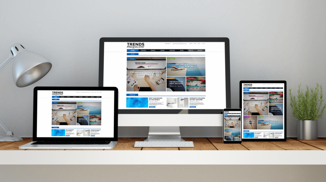
For many, optimising their ecommerce website for mobile devices sounds like a big dilemma at first. Hence most of them end up ignoring the necessity of it, which is one of the ecommerce design mistakes.
But in a mobile-first era, when most of your users are using a mobile device to shop online, and if your website lacks prominent click-to-call or site research functionality or comes with excessive viewport obstructions, you will end up creating a frustrating user experience.
So, to ensure that your site looks great on a computer and on the phone as well, you need to place your focus exclusively on mobile customers. Maintain a responsive design, deliver an omnichannel shopping experience, design considering your user’s thumb, optimise visuals, simplify navigation, avoid pop-ups and test it over and over on multiple devices.
10. Complicated website layouts
In the age of short attention spans and first browsing, simplicity is a must. With a cluttered design, you will end up overwhelming your users by making it tough for them to find the thing they are looking for. Often, designers make the mistake of adding too many menus, categories or colours, fonts and interactive features in a single site. And this ends up making visual clutter. Suppose you visit a fashion site that has dozens of nested options like - Men > T-Shirts > V-Neck, Crew Neck, Polo, Oversized," and so on. This will automatically slow down your shopping experience.
Instead of adding excessive elements, it is better to keep things simple. Maintain an intuitive layout with clear main categories and smart filtering options.
11. Lack of SEO content optimisation
This one is a costly ecommerce web design mistake. SEO is not just about writing text; rather, it is something that shapes the design of your website. While most online stores keep their prime focus on aesthetics, including visuals, product layout or branding, many tend to forget that their content needs to be discoverable by search engines like Google.
And when SEO is ignored in web design, it can result in low search visibility for relevant products or services. Suppose your product pages are buried under several clicks and aren't internally linked; search engines will not find them. Optimising a website for SEO includes structuring the website content in a way that makes it easier for search engines to crawl, index and rank for relevant search queries.
12. Providing insufficient info about the business
In the early days of the world wide web, people were a lot more suspicious about the internet, particularly when it came to buying products, providing credit card details, personal information and the like. Today, a lot of that distrust is gone – but not all of it.
While users today aren’t going to be cynical about how safe it is to buy from your website, they may be cynical about how relatable your products and you yourself are as a provider. It’s important to give visitors a reason to see you as a genuine, respectable business, and that means providing information.
You’ll notice that even on ecommerce websites, the About page is one of the most visited pages on the website. This indicates that people like to have the option of getting a little information about a company when they browse a website. Yet so often ecommerce stores will not have About or Contact pages on the website.
This is a big mistake. To set yourself up as a legitimate brand, you need to provide information about the business; who you are, how long you’ve been in the game, your story, what kind of business you want to be, etc. The About page allows you to do just that while ensuring you gain the confidence of your website visitors.
Other elements that can help convey professionalism include a phone number, address, logo, domain name email or an onsite chat option.
Getting the balance right and maintaining an online store that converts consistently is difficult, but it’s certainly achievable if you have put the work in. Part of what makes it difficult is the fact that you can have everything working well but make one costly mistake that leads to your downfall.
Luckily, if you avoid what we’ve discussed in this article, you’ve got every chance of making it work.

